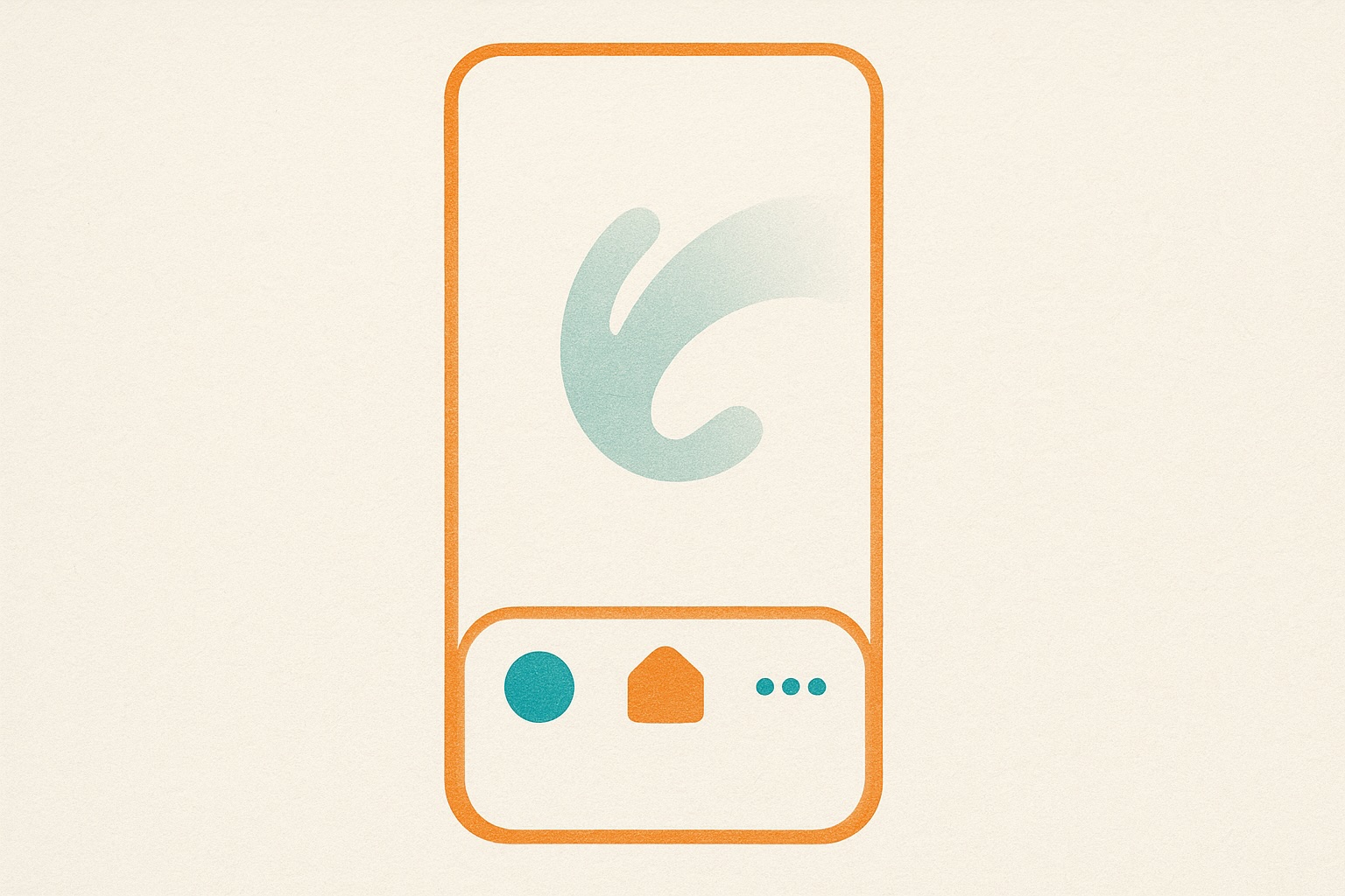
Bottom Navigation for Mobile & Tablet
Mobile navigation just got better. We’ve added a persistent bottom navigation bar for mobile and tablet users.
What Changed
Before
- Top-only navigation (requires scrolling up to switch pages)
- Hamburger menu for secondary navigation
- Harder to jump between sections while browsing
After
- Bottom nav bar always visible (thumb-friendly)
- Quick access to Brands, Founders, Insights, Markets
- 44px touch targets (iOS Human Interface Guidelines)
- Automatic hide on scroll down (more reading space)
- Reappears on scroll up (always accessible)
Why Bottom Navigation?
Thumb zone optimization: On phones 5.5" and larger, the bottom third of the screen is the easiest area to reach with one hand.
Context switching: Users can jump from a brand profile to market insights to founder stories without scrolling to the top.
Platform conventions: Native apps (Instagram, Twitter, YouTube) all use bottom nav—it’s familiar and intuitive.
Responsive Behavior
- Mobile (< 768px): Bottom nav visible
- Tablet (768px - 1024px): Bottom nav visible
- Desktop (> 1024px): Traditional top navigation only
Technical Details
- Sticky positioning: CSS-based, no JavaScript required
- Touch-optimized: 44px minimum target size
- Animated transitions: Smooth show/hide on scroll
- Accessibility: Proper ARIA labels, keyboard navigation support
What’s Next
We’re exploring adding a search icon to the bottom nav for even faster access to our brand database.
Try it out—open Brandmine on your phone and explore. Navigation should feel natural and effortless.