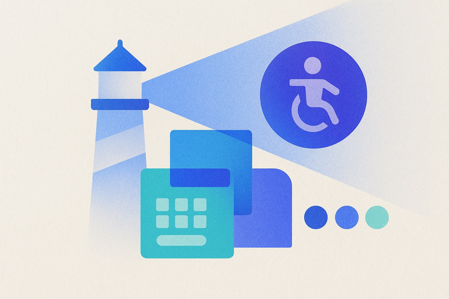
Making Brandmine Accessible to Everyone
Accessibility isn’t an afterthought—it’s a core value. This week, we implemented Lighthouse CI to continuously monitor our site’s accessibility, performance, and SEO.
What We Fixed
Keyboard Navigation
- ✅ All interactive elements now accessible via keyboard
- ✅ Skip-to-content links for screen reader users
- ✅ Visible focus indicators throughout the site
Heading Hierarchy
- ✅ Fixed all heading progression issues (H1 → H2 → H3)
- ✅ Screen readers can now navigate page structure correctly
- ✅ Improved content organization across all pages
Color Contrast
- ✅ All text meets WCAG AA standards (4.5:1 minimum contrast)
- ✅ Dimension tags updated for better readability
- ✅ Interactive elements have sufficient contrast in all states
Colorblind-Friendly Design
- ✅ Timeline uses blue-based spectrum (no red-green combinations)
- ✅ All color coding includes redundant visual cues
- ✅ Accessible to users with deuteranopia, protanopia, and tritanopia
Continuous Monitoring
We’ve integrated Lighthouse CI into our development workflow. Every deployment now runs automated accessibility audits to ensure we maintain these standards.
Our Scores
- Accessibility: 94-96 (enforced minimum)
- Performance: 60-69 (baseline—optimizations coming)
- SEO: 92-100
- Best Practices: 75+
Why This Matters
~8% of males and ~0.5% of females have red-green colorblindness. Many users rely on keyboard navigation. Everyone benefits from clear contrast and logical page structure.
Accessibility is illumination. We’re committed to ensuring everyone can discover exceptional Global South brands.